
When audiences watch a film, advertisement, documentary, or social media video, they often focus on the story, characters, and visuals. However, one of the most powerful storytelling tools works silently in the background—color. Colors have the ability to influence emotions, guide attention, establish mood, and shape how viewers interpret a scene without a single word being spoken.
Color is much more than visual decoration. Every color carries psychological meaning. Warm colors such as red, orange, and yellow often create feelings of energy, passion, warmth, or excitement. Cooler colors like blue and green can communicate calmness, trust, loneliness, or mystery. Filmmakers and content creators use these emotional associations intentionally to strengthen storytelling and audience connection.
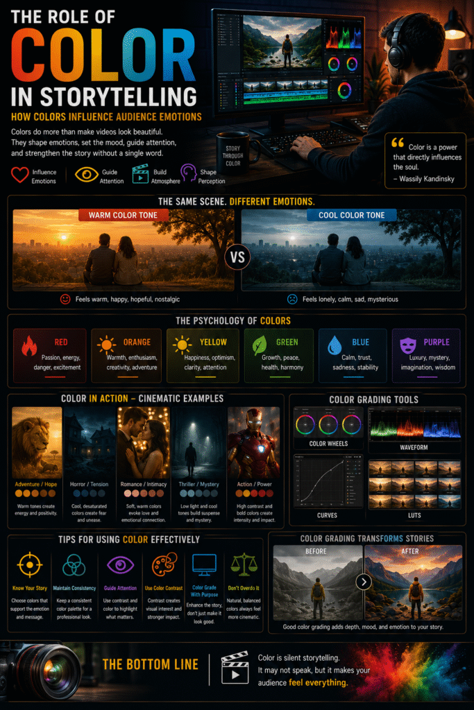
Imagine watching a scene where a character receives life-changing good news. If the scene is filled with warm golden tones and bright sunlight, it naturally feels hopeful and uplifting. Now imagine the same scene presented with dark blue tones and low contrast. The emotional interpretation immediately changes, even though the action remains identical. This demonstrates how color can dramatically influence audience perception.
Color also helps establish atmosphere. Horror films often use darker, desaturated palettes to create tension and uncertainty, while romantic scenes frequently feature softer and warmer tones to evoke comfort and intimacy. Through careful color choices, creators shape the emotional environment before audiences consciously realize it.
Another important function of color is directing viewer attention. Bright colors naturally attract the eye, while muted backgrounds help important subjects stand out. Editors and colorists use contrast strategically to guide audiences toward key visual elements and storytelling moments.
Color consistency is equally important in professional content creation. Videos are often filmed under different lighting conditions and locations, which can create visual inconsistencies. Color grading helps unify these scenes, creating a cohesive and polished viewing experience that feels natural and immersive.
In modern digital content, color plays a major role in branding and identity as well. Many successful creators maintain consistent color styles across videos, thumbnails, and social media content. This visual consistency makes content instantly recognizable and strengthens audience familiarity.
Beyond aesthetics, color contributes directly to emotional storytelling. A subtle shift from warm tones to cooler tones can symbolize character growth, emotional change, or narrative progression. These visual cues help audiences understand the story on a deeper level without relying solely on dialogue.
However, effective color usage requires balance. Excessive saturation, unrealistic grading, or inconsistent color choices can distract viewers and weaken the storytelling experience. The best color grading feels intentional, natural, and supportive of the narrative rather than overwhelming it.
Ultimately, color acts as a silent language within visual storytelling. It communicates emotion, atmosphere, symbolism, and meaning in ways that audiences instinctively understand.
🎯 Conclusion
Great storytelling is not only about what audiences see—it is also about how visuals make them feel.
Color shapes emotion, creates atmosphere, strengthens narrative impact, and guides audience perception throughout the viewing experience.
In the end, viewers may not consciously notice every color choice, but they will always feel the emotional impact those colors create.